Infographics are a great way to learn about a subject in an easy and fun way. In this article, you’ll discover a variety of infographics and visualizations associated with long distance relationships.
Use them when educating others about your relationship, share them with fellow LDR enthusiasts or learn a bit yourself. Either way, they’re fun to look at!
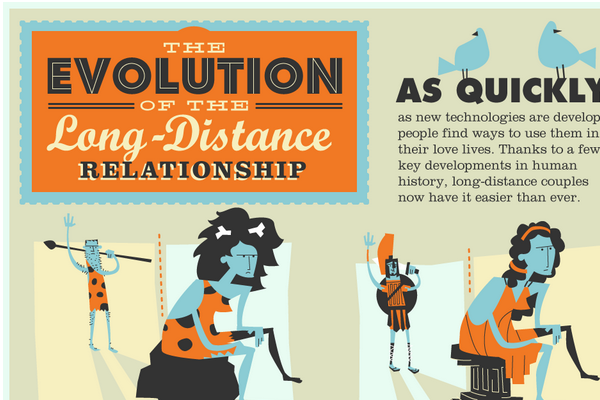
1. The Evolution of Long Distance Relationships is a visual representation of the different forms that long distance relationships have taken through history.
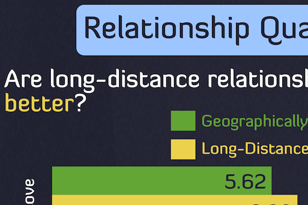
2. Long Distance Relationships: The infographic has several facts about LDRs including the question “Are Long Distance Relationships Better” than geographically close relationships? The answer might surprise you!
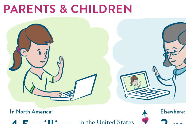
3. Are You A Long Distance Lover? Shows us the 4 types of long distance relationships along with statistics about each one. What we love about this infographic is the fact that It includes non-romantic LDRs as well.
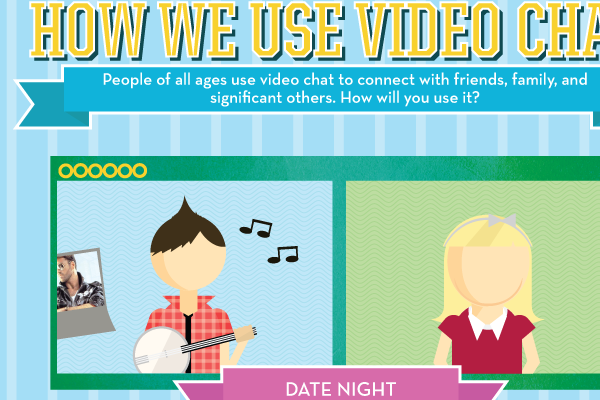
4. The Video Connection outlines the different ways that people use video chat -both in an LDR and outside of one. We think LDRs dominate the majority of this infographic though.
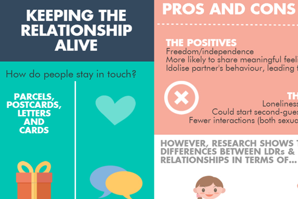
5. Ipostparcels created this infographic on various aspects of Long Distance Relationships such as the reasons why there are so many LDRS and the pros and cons of being in one.
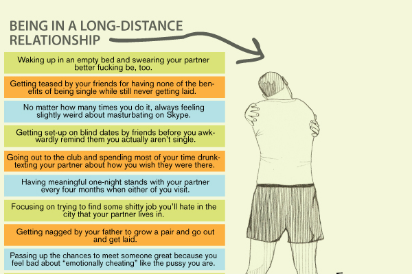
6. Being Single VS. A Long Distance relationship offers a somewhat cynical, somewhat humorous look at the pros/cons of being in an LDR vs just throwing in the towel and being single.
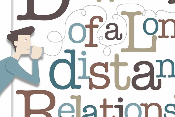
7. Downside of a Long Distance Relationship is an infographic by Colin Goh that gives us 8 comical downsides to being in an LDR.
So that’s all 7 of them! What do you think of these infographics? How accurate are they about you and your LDR?


